When you are done, copy your file to the server as in previous labs.
Part 1: Characters
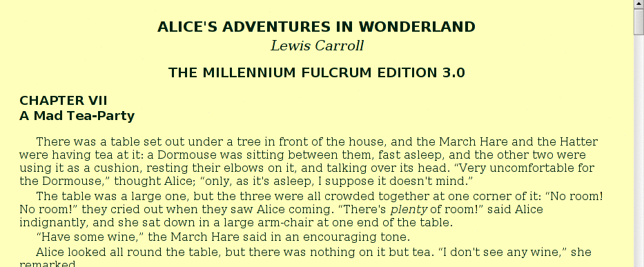
- Download alice.html and store it on the desktop. Your browser should offer to save the file when you click the link, otherwise right-click, then choose “Save Link As” or “Save Target As”.
- Find the file on the desktop, and double-click it to open the web browser.
- Open notepad from the start menu, and use it to open the file as well.
- The first seven lines of the file are:
<!DOCTYPE html> <html> <head> <meta charset="utf-8"> </head> <body> <h1>ALICE'S ADVENTURES IN WONDERLAND</h1>Some browsers may add lines to the front of the file when you download and store it. If you see some things added to the top of the file, delete them.
- Add some appropriate <title>…</title> to the header. Reload the browser.
- The original document uses
pairs of single quotes for quote marks. For instance, part of the
first paragraph looks like this:
over its head. ``Very uncomfortable for the Dormouse,'' thought Alice; ``only, as it's asleep, I suppose it doesn't mind.''Notice that pairs of characters are used to open and close each quotation. Your browser renders it like this:over its head. ``Very uncomfortable for the Dormouse,'' thought Alice; ``only, as it's asleep, I suppose it doesn't mind.''
We can improve the appearance of quotes by using the “ and ” entities instead. The HTML will look like this:
over its head. “Very uncomfortable for the Dormouse,” thought Alice; “only, as it's asleep, I suppose it doesn't mind.”Which your browser renders as:over its head. “Very uncomfortable for the Dormouse,” thought Alice; “only, as it's asleep, I suppose it doesn't mind.”Use the Edit/Replace facility of notepad to replace each``with “, and each''with ”:- From the Edit menu, choose Replace.
- Enter
``as the “Find What”.
That's two left single quote characters, not a double quote! Look in the upper left corner of the keyboard. - Enter “ as the “Replace With.” Don't forget the semicolon!
- Click “Replace All”
''with ”. Note that the''is two regular tick marks, which are right next to the enter key on most keyboards. - The original document uses -- for a dash. You should replace these with a real dash. Use the Edit/Replace facility to replace each -- with —. It will look best if you put a space on each side of the —, so replace each pair of dashes with a space, — and another space.
- The Mad Hatter sings an unusual version of Twinkle, Twinkle,
Little Star which involves bats. In the downloaded page, this section
looks like this (after the quote substitutions mentioned above):
“We quarrelled last March — just before <i>he</i> went mad, you know — ” (pointing with his tea spoon at the March Hare,) “ — it was at the great concert given by the Queen of Hearts, and I had to sing</p> <p> `Twinkle, twinkle, little bat! How I wonder what you're at!'</p> <p>You know the song, perhaps?”</p> <p>“I've heard something like it,” said Alice.</p> <p>“It goes on, you know,” the Hatter continued, “in this way: — </p> <p> `Up above the world you fly, Like a tea-tray in the sky. Twinkle, twinkle — ' ”</p> <p>Here the Dormouse shook itself, and began singing in its sleep
In the browser, the line breaks are lost, the section looks like:
![[Song lines run together]](cssbasics/badflow.gif) The <pre> tag is used to tell the browser to keep the original spacing.
Replace the <p>…</p> surrounding each section of the song with <pre>…</pre>
tags (Note: Do not make a global change with the replace dialog)
and arrange the lines so the page looks like this:
The <pre> tag is used to tell the browser to keep the original spacing.
Replace the <p>…</p> surrounding each section of the song with <pre>…</pre>
tags (Note: Do not make a global change with the replace dialog)
and arrange the lines so the page looks like this:
![[Lines Arranged]](cssbasics/goodflow.gif)
- In the second paragraph, the word PLENTY is given in all caps.
Change it to be lower case italics, like plenty. You may recall
that <i>…</i> creates italic text.
The next two steps are optionalIf you're running behind on time, feel free to skip these last two steps. You may return to them as you have time.
- Find the other words which are all caps and change them to be italics, just as PLENTY. I found 17 other cases.
- There are quotes within quotes which are set off with ticks, `just like this.' They would look better if they were replaced with ‘ and ’, respectively: ‘like this’. Make that change where needed. There are about ten places.
Part 2: Style Sheets
Style sheets are a relatively new facility in HTML which allow the page creator to control the way the a browser displays features of his or her page. First off, add a style section. It should go within the header, perhaps right after the title you added earlier. For now, it's empty, so the top of your page will just something like this:Note: There is only this one style section, and the exercises have you add directives to this section. Don't create additional <style> tags, or place directives outside this single style section just added to the header in the header.
In this portion of the lab we will add style directives, but make no other changes to the document. All the changes in this section are made between <style> and </style>.
- Add this line between the <style> and <\style>:
h1 { font-size: 130%; }This gives an instruction about how to display the <h1> tag, and the instruction is that the size of the characters used (the font size) should be 130% of normal. That is, 30% larger than the regular text. Add this line and refresh your browser. You should actually see the title get smaller. This is because the browser normally displays <h1> text at something over 200%, so we have actually told it to make the text smaller than it usually does. Mine looks something like this:

- Add similar instructions to set text sizes for <h2> and <h3>. Choose descending sizes which are still larger than the normal text (more than 100%).
- Observe where the author's name is listed. The HTML is
<p class="author">Lewis Carroll</p>The class attribute is designed to work with style settings. Add the following line to the <style>…</style> section:p.author { font-size: 125%; font-style: italic; }Now refresh the browser. This direction tells the browser how to display a paragraph which is marked with the class="author" attribute. (In our case, we only have one such.) The author's name is larger, and displayed in italics.
- Now, to each of the directions you just created,
for h1, h2 and p.author, add
the direction text-align: center;. For instance, your
h1 instruction might become:
h1 { font-size: 130%; text-align: center; }Add this direction to h2 and p.author as well. Reload the browser. Mine looks like this:

- A couple more changes in the titles. For each of the h1, h2 and h3 directions, add this: font-family: sans-serif;. This changes the font to something more usual for titles.
- Secondly, for the h1 (but not the other hn tags), add this:
margin-bottom: 2pt;
and for the p.author add the similar one:
margin-top: 0pt;
Reload the browser.
The browser puts a certain amount of space before and after things. Here,
we're telling it to put two points after the <h1>…</h1>, and zero before
the author paragraph. These settings are both less than what the browser
will do without instruction. A point is a printer's unit, about
1/72 of an inch. Letter sizes
(font sizes) are measured in points; 12-point is a common size.
After all these changes, the top of my page looks like this:

- Now add this instruction to the <style>…</style> section:
p { margin-top: 2pt; margin-bottom: 0pt; text-indent: 0.25in; }This applies to all paragraphs, so it will have a significant effect on the appearance of the document. It sets margins, and the text-indent instruction asks for indented paragraphs rather than the block ones the browser produces by default. Reload the browser.
- If you look carefully, you may notice that the author's name is no longer centered properly. If you can figure out why, fix it. (If not, just proceed. We'll talk about it later.)
- Since the entire document is contained within the <body>…</body> pair,
directions for its display can change the appearance of the whole document.
Start by adding this directive:
body { margin: 0.75cm; }Reload, and you will see some blank space around the edges of the document. The units here are centimeters.
- You can also control the colors in the document from the style sheet.
The color: directive sets the color used to display the text, and
background-color: sets the, uh, background color. Add these to
our existing body directive. Choose some colors for text and background
which you like, which go together, and have enough contrast that you can
still read the page. (What happens if you make them the same?)
For a dramatic effect, you might try a dark background with lighter lettering.
You may specify any of the 16 named colors, or use the numeric notation, like #8844AA.
- Finally, the two song sections which were formatted with
<pre>…</pre> look funny because they are set in a different font. Fix it
with
pre { font-family: serif; }You might also want to set a left margin to indent the songs if you think that looks better.

Part 3: Adding An Inset
This part is optional.
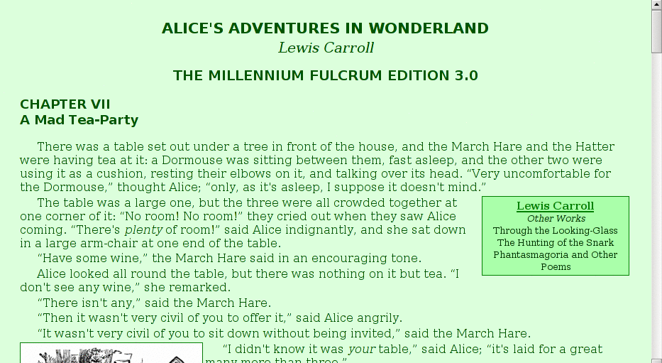
- First off, we want to be an inset, so it should stay to the right
and the main text should flow around it. The required style incantation is:
div.rightinset { float: right; width: 200px; }The width directive simply keeps it from taking up a lot of horizontal space, and the float makes it stay at the right and the text flow around. If you like it better at the left, feel free to float it there.
- Put a box around it. Add the direction
border: 1px solid black;to the instructions for div.rightinset (Feel free to use several lines now that it's getting kind of long. You can start a new line anywhere spaces go.) You might want to choose a color other than black to go with your page colors.
- Make the font size in the inset a little smaller than the usual size.
- Add the text-align: center directive to the inset block.
- Set text and background colors for the inset. Choose colors that look nice with main body colors.
- You may want to add some margin to the inset to push the surrounding text away from the box. If you want to push the box away from the text it contains, that is called padding; you can specify padding: size much as you specify margins. Set what you think looks nice.
- To change the text in the link, use a directive like this:
div.rightinset a {...}Whatever you put here will apply to any <a>…</a> (all one of them) within the <div> marked rightinset. You should make the text there larger, and set the color to something that goes with the rest of your page. You may want to use bold or italics if you think that looks best.
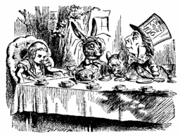
- Download the following picture:

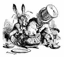
Add it your page wherever you like. Have it float to the left, so the text flows around it. - While you're at it, add this one near the bottom:

Float it however you like. Images also take the border directive if you would like to add one.
