See text at p. 439, but there is quite a bit more here.
There are various ways to make things, usually boxes, go where you want them.
- Horizontal centering.
- Centering text: text-align: center;
- Centering a box:
- Give the box some width less then than 100%.
- Set margin-left: auto; margin-right: auto.
- Or, you can do the math yourself:
- Set the box width to a percentage w, then set its left margin to (100−w)÷2 percent.
- If you have a border, use box-sizing: border-box.
- This is more clever, but less general, since you must set your box width to a percentage.
- By default, boxes stack top to bottom, and stay at the left.
- You can move to the right using a left margin.
[ Stairs Source ] - Placing boxes horizontally.
- Traditional device is to use float: right or float: left. This was intended to let text flow around a box (including an image). But it can be used to arrange boxes.
- display: inline-block makes boxes flow like fat characters.
- Use vertical−align: attribute. Usually attribute is top or bottom. The default is baseline, which usually is not what you want.
- If you intend the boxes to form a single row on the page, use white-space: nowrap to keep them from flowing.
- Relative positioning.
- Allows you to shift an object from its regular position.
- Surrounding objects are positioned as though it had not moved.
- position: relative then left: dimension, right: dimension, top: dimension and/or bottom: dimension to shift the element.
- Dimensions move the side “back”, so left moves the element right, and right moves it left. Top moves it down, and bottom moves it up.
- Dimensions may be negative, so the actual motion is the opposite way.
- Absolute positioning.
- Sets the position “absolutely” inside the nearest container which is positioned in some way (not static).
- Set position: absolute, then left: dimension, right: dimension, top: dimension and/or bottom: dimension set the position relative to the upper left corner of the containing box.
- Surrounding material is positioned as if the box did not exist.
- Fixed positioning.
- Similar to absolute, but relative to the browser window, not any enclosing box.
- This means won't move when you scroll.
- Overflow.
- What to do with the content of a box that spills outside its container.
- Attributes are overflow: value, overflow−x: value and overflow−y: value, for all overflows, or to specify horizontal and vertical separately.
- Usual values are visibile (default), hidden and scroll.
- Stacking.
- Boxes which don't use default position can land on top of each other.
- By default, the last one appears.
- Can control by assigning z−index: integer. Specifies a stacking order; the largest z-index is visible.
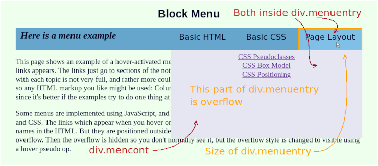
- Making elements disappear.
- This is not positioning, really, but sometime useful when making fancy arrangements.
- display: none. The box is not displayed, and takes up no space.
- visibility: hidden. The box is invisible, but still takes up its usual space.
- Often used with hover to make things appear when you point to something.
- But be careful about having to re-arrange the page when you move the mouse. Can get ugly.
- An Image Layout. [ Image Index Source Style Sheet ]
- Menu Example.
[ Menu Example Source ]
- More Complex Menu Example.
[ Menu Example Source
Style Sheet ]